Prestaged Radar – 6 design stories to know now
New Nordic collaborations, an unexpected Disney encounter, a classic making a comeback and a colour pointing towards 2027. Prestaged gathers six things happening in the design world right now – and why they are worth remembering.
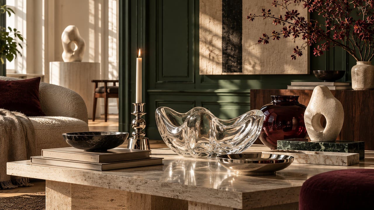
Byredo × Iittala – when light, glass and scent become one object
Byredo and Iittala have joined forces on LJUS, a limited collection where glass, candlelight and fragrance meet. Launching during October 2026, it comprises several objects made for the smaller rituals of everyday life – among them a candle refractor, diffuser vessels, candle lids, an incense holder and candle plates.
Several pieces are made in Finland and mouth-blown by hand at Iittala's glassworks. The large candle refractor is perhaps the collection's clearest statement: a sculptural glass object that changes once a candle is placed inside and the flame is refracted through its undulating form.
What makes the collaboration interesting is how it moves the scented candle away from being a consumable and into the interior itself.
Prestaged notes: The boundaries between scent, lighting and decoration keep dissolving. More and more objects are expected to do more than one thing – and to deserve their place on display even when they are not in use.
Webster Green is Benjamin Moore's colour for 2027
Benjamin Moore has named Webster Green HC-130 its Color of the Year 2027. It is a deep, classic green rather than the pale sage that has been everywhere in recent years. Benjamin Moore describes the choice as a shade with both stability and energy – a colour that works across several different periods of style.
Alongside Webster Green comes a palette of seven further colours: White Down, Nelson Blue, Shakespeare Tan, Antique Copper, Wild Aster, Durango and Townsend Harbor Brown. The result leans clearly towards warmer, more historically rooted shades.
That may be the most interesting part. After several years in which pale beige and muted natural tones have been the default, colour once again seems to be allowed to become part of a room's architecture – on walls, joinery, kitchen fronts and doors, rather than only in small details.
Prestaged notes: Less cautious sage, more library, wood panelling and English townhouse. Green is stepping out of its role as a trend accent and becoming a proper foundation again.
Gustaf Westman meets Mickey Mouse
Swedish designer Gustaf Westman is behind one of the more unexpected design collaborations of the autumn. Together with Disney, he has created a collection inspired by Mickey & Friends, translating the familiar characters into Westman's rounded, colourful design language.
The first pieces include a Mickey Tumbler, a ceramic Mickey Cup and a black leather sofa. More pieces will be revealed during October before the full collection launches online on 15 November.
It is easy to dismiss collaborations like this as merchandise, but something more interesting is happening here. Westman uses the ears, colour combinations and silhouettes of the characters as the very form of the objects, rather than simply placing Disney motifs on top of existing products.
Prestaged notes: This shows how pop culture continues to move into collectible design. Playfulness no longer has to stand in opposition to expensive or collector-oriented design.
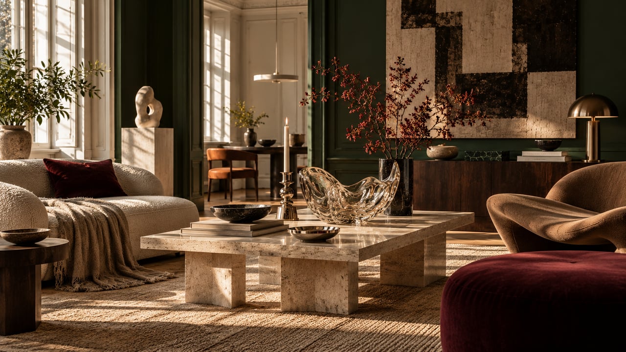
Poul Henningsen's PH Piano returns
Louis Poulsen is reissuing the PH Piano as a Limited Edition 2026. The lamp was originally designed by Poul Henningsen in the early 1930s as task lighting for pianists. Henningsen was a composer himself, and the construction made it possible to direct glare-free light over both the sheet music and the keys.
The 2026 version comes in aged brass with PH 1/1 shades in Dusty Terracotta. The construction has also been adjusted slightly so that it works better as an ordinary table lamp on a desk, a bedside table or in a window.
It is a fine example of a reissue that is about more than nostalgia. The original idea remains, but its use has been broadened for today's homes.
Prestaged notes: The best reissues remind us why the original was good in the first place. The PH Piano still looks unusual almost a hundred years on – precisely because it was created for a very specific need.
Design Miami Paris opens now
20 October is the preview day for the fourth edition of Design Miami Paris, ahead of the public days from 21 to 25 October. The fair returns to L'hôtel de Maisons on Rue de l'Université, bringing together international galleries, collectible design, installations and special partner presentations.
For Prestaged, the fair matters well beyond the collector market. It is often here that forms and materials appear in concentrated form, before similar expressions begin to filter out into the wider world of interiors.
That is why we will be keeping a particularly close eye on Paris this week: not only on which objects sell, but on which shared ideas begin to emerge.
Prestaged notes: What we are looking for is not the next viral chair. It is more interesting when several independent designers suddenly start working with the same materials, silhouettes or techniques. That is usually where a larger shift begins to show.
Five names to take away from PAD London
PAD London closed on 18 October in Berkeley Square. It is the UK's only fair devoted entirely to historical and contemporary design, and has become an important meeting place for collectible design.
Among the names that stood out this year were the London-based Japanese ceramicist Noe Kuremoto, the Mexican designer Manuel Bano, the textile artist Adriana Meunié, Korea's Seungjin Yang and the German designers Lukas Wegwerth and Corinna Dehn.
Their work differs sharply. Kuremoto works with ceramics, folklore and Japanese history. Bano starts from metal and the inherent qualities of the material. Meunié creates large textile works. Yang has made furniture from his Blowing Series, using balloons reinforced with epoxy, while Wegwerth and Dehn present furniture inspired by protective shells and traditional building techniques.
What they share is an attitude rather than an aesthetic: the material and the making are allowed to be visible parts of the story.
Prestaged notes: Much of the most interesting design right now is hard to reduce to a trend. Material, process and craft are given room – and that makes the objects more relevant over time.
What we read between the lines
Six stories, but one fairly clear shared movement.
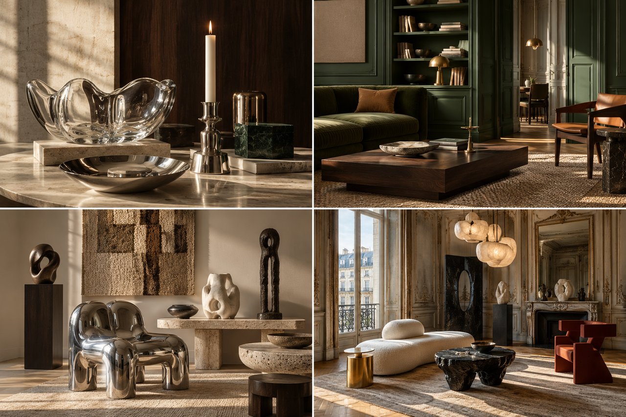
After a long period in which much of the interiors world sought calm through neutrality, the next phase seems to be more about character. Deeper colours. Polished metal. Glass allowed to become sculpture. References to history and pop culture. Objects where the making is revealed rather than hidden.
That does not mean minimalism is disappearing. Rather, it has competition.
The home once again seems allowed to be a little more personal, a little stranger – and considerably harder to sum up in a single trend word.
Prestaged Radar follows the design news, launches, collaborations and names we think are worth discovering before they are everywhere.