Style guide
Turn-of-the-century interiors – when architecture leads
Stucco, panelled doors and herringbone parquet already do the work. The rest is about not competing with them.
Read the guidePoul Henningsen's 1958 pendant was not designed to become an icon. It was designed to make bad light better.
PH 5 feels almost inevitable today. Yet its form did not begin with the desire to create a distinctive silhouette. It grew out of decades spent addressing a far less glamorous problem: how to stop electric light from glaring.
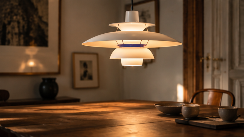
It is easy to look at the PH 5 and see a form.
The broad shades.
The small cylinder at the centre.
The layers that seem almost to float above one another.
A silhouette so familiar it barely needs an introduction.
But Poul Henningsen did not begin there.
He began with light.
When electric light took hold, our rooms changed quickly.
The problem was that the light source itself was harsh.
It was visible.
It glared.
And it produced a light that Henningsen felt did not serve people particularly well.
From the mid-1920s, he began systematically exploring how shades could direct light where it was needed while keeping the bright source out of direct view.
Designmuseum Danmark describes his work as a long, scientific pursuit of soft, glare-free light — one that continued right up to his death in 1967.
That is where the PH system was born.
Not as decoration.
As optics.
Henningsen developed his three-shade system during the 1920s.
The principle was simple to grasp but far harder to get right:
light should be reflected between several shades rather than thrown straight out from a bare bulb.
That made it possible to direct the light downwards and outwards while concealing the source itself.
A 1926 prototype in Designmuseum Danmark's collection is described as the starting point for a long line of later PH lamps.
The museum also used a PH fitting when, in 1926, it became the first museum in Denmark with electric lighting.
It is an important detail.
The PH 5 did not appear out of nowhere in 1958.
It was the next step in a system Henningsen had already been refining for more than three decades.
Light bulbs were changing.
Their shapes changed.
Their sizes changed.
And so did the way the light struck the shades.
Louis Poulsen describes the PH 5 as Henningsen's answer to precisely that problem: he wanted to create a fitting that did not depend on a particular bulb shape.
That is why the PH 5 is not simply another version of the three-shade system.
It sets out to make the system more robust.
The lamp had to work even as the light source changed.
The name PH 5 refers to the 50-centimetre diameter of its main shade.
But what has kept it relevant for so long is not really the measurement.
It is that the form is a response to function.
The PH 5 looks complex.
Yet there is a logic to almost every layer.
The large upper shade catches and reflects light.
Smaller shades beneath direct it onwards.
The light source stays hidden from most normal viewing angles.
The result is light that falls mainly downwards and to the sides, rather than straight into your eyes.
That is why the lamp feels so natural above a dining table.
It turns the table itself into the bright surface.
The room around it can be darker.
And the lamp never becomes a harsh point you try to avoid looking at.
Prestaged note: The most characteristic thing about the PH 5 is not its form as such. It is that the form can be read as a map of what the light is meant to do.
The original version had red and blue elements on the inside.
Today, that might look like a purely graphic choice.
It was not.
Louis Poulsen describes them as a way of improving the colour of the light produced by the bulbs of the time. They were later removed, once newer light sources could render daylight far more faithfully.
It is yet another example of the same thing:
appearance followed technology.
When the technology changed, the details could change too.
Some design objects have functions that all but disappear behind their status.
The PH 5 becomes more interesting when you do the opposite.
When you set its icon status aside for a moment and look at it as a machine for light.
Then the shades make more sense.
So do the proportions.
And even its slightly curious appearance becomes more logical.
It is not a minimalist lamp.
It has too many parts for that.
But nor is it decorative in the way a sculptural pendant can be.
It sits somewhere between technology and object.
Part of the answer is that it was never especially tied to a particular interior style.
The PH 5 can appear in:
a turn-of-the-century room, a Danish modernist home, a pared-back new-build kitchen, above a worn wooden table, or alongside far younger furniture.
That is partly because the lamp has a strong identity of its own.
It does not need to match anything.
But it is also because its core function is still relevant.
We still sit at dining tables.
We still need light above them.
And we still dislike being dazzled.
It is harder for an object to feel dated when the problem it solves is still with us.
Designmuseum Danmark describes the PH system as a cornerstone of Danish design history and notes how commonplace PH light has become in Danish homes and public spaces.
That is almost the opposite of how we tend to think about a design icon.
An icon is expected to be rare.
The PH lamps instead became culturally powerful through repetition.
They hung in homes.
Restaurants.
Offices.
Institutions.
Above tables where, after a while, the lamp itself may barely have registered.
That is close to Henningsen's original ambition.
Designmuseum Danmark describes his ideal as a useful and accessible everyday product, rather than an exclusive object for the few.
Which makes its later status as an expensive design classic a little ironic.
The PH 5 does not need a Danish teak table beneath it.
On the contrary, it can become more interesting when the context is less expected.
Above a rough old wooden table.
In a stainless-steel kitchen.
Against dark oak.
In a room with plenty of stone.
Or in a strong colour against an otherwise calm interior.
What matters most is the height.
The PH 5 is made to create a concentrated pool of light over a surface.
Hang it too high and some of that intimacy is lost.
Hang it right and the table becomes almost a room within the room.
The PH 5 was designed in 1958.
But the story begins more than thirty years earlier.
With a designer who was bothered by glaring electric light.
Perhaps that is why the lamp still works so well as an example of design.
It shows what can happen when form does not begin with the question:
What should it look like?
But:
What problem are we actually trying to solve?
Prestaged note: The PH 5 did not become timeless by trying to look timeless. It became timeless because the problem it solved never went away.
Prestaged distinguishes between historical facts, traditional beliefs, modern interpretations and scientifically supported connections. Our features are fact-checked against academic and institutional sources. Where research is uncertain or disputed, we say so. Sources appear alongside relevant claims and are also collected below.
Selected environments, guides, longer reads and details worth saving. Curated by Prestaged.
Stucco, panelled doors and herringbone parquet already do the work. The rest is about not competing with them.
Read the guideVisible grain, a hard-wearing surface and enough weight to anchor a room without making it dark. How to combine dark oak.
Read the guideDurable, honest and finished with a soft matt sheen that ages well. How to avoid the professional-kitchen look.
Read the guide