Colour & materials
Beige without going flat
One of Sweden's most common interior colours is also one of the hardest to get right. Three levels of lightness are enough to create depth.
Read the guideThe answer to flat neutrals is rarely more colour. It is contrast in material, weight and texture.
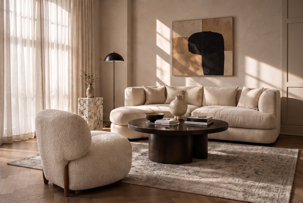
A home in beige and neutral tones can easily feel comfortable but flat. The solution is rarely more colour — it is contrast in material, weight and texture.
One genuinely dark element in each room gives the eye a place to rest: a black table leg, a dark timber frame, a bronze lamp base. It does not need to be large.
Smooth linen against coarse wool, a limewashed wall against polished stone, matt timber against shiny metal. Two surfaces in the same beige can create a strong contrast if they feel different.
Deep curtain folds, a ribbed cabinet front, a fluted plinth. Relief creates its own shadows and adds depth without changing the palette at all.
Beige and greige both come in warm and cool undertones. A cooler grey note against a warm beige base adds definition without breaking the colour scheme.
In an entirely matt palette, one reflective element — brass, chrome or glass — can become the brightest point in the room.
One of Sweden's most common interior colours is also one of the hardest to get right. Three levels of lightness are enough to create depth.
Read the guideTextiles soften sound, filter light and make a room feel finished. Linen, wool and bouclé in practice.
Read the guideThe furniture works beautifully on its own, yet the room still feels unfinished. Seven recurring reasons — and what to do about them.
Read the guide