Style guide
Eclectic interiors – rooms built over time
Inherited pieces, finds and new purchases in the same room. What holds it together is rarely the style — it is the palette.
Read the guideElegance does not have to mean restraint. How to mix patterns with a clear hierarchy: one dominant design, three levels of scale, colours that connect and calm surfaces that let the patterns breathe.
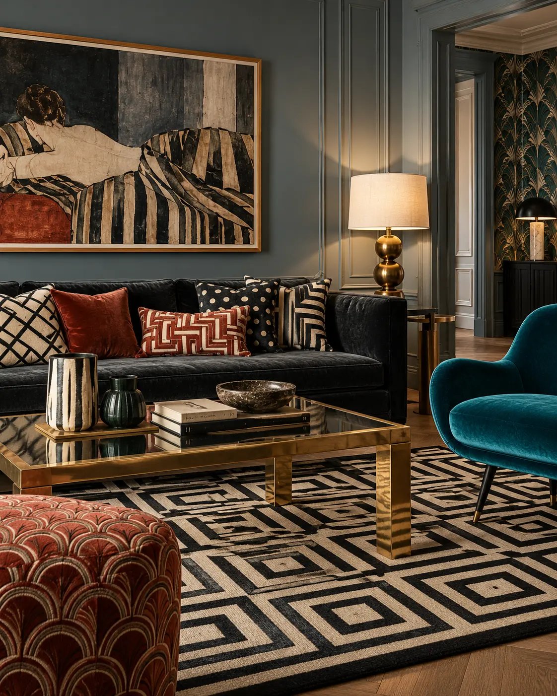
Elegance does not have to mean restraint. A room with several patterns can feel more considered than an entirely neutral one, provided the patterns have a clear order of importance. This is not a guide to chaotic maximalism but to controlled pattern mixing: how to be bolder and still have a room that feels composed and quietly luxurious.
Prestaged notes: A room is not elegant simply because it is restrained. Often it is the controlled collision that makes it interesting.
Every pattern mix needs a lead. It might be a rug, a wallpaper, a curtain fabric or an upholstery, but it should be obvious which pattern carries the most weight.
The dominant pattern is usually the largest, the boldest in colour or the one covering the most surface. Everything else responds to it, in colour, scale or character.
When several patterns compete to be the most important, the room feels restless. When one leads and the others follow, you have a composition.
Scale is the most important tool in mixing pattern. A simple rule of thumb is three levels:
Two patterns of identical scale nearly always compete, even when the colours agree. The eye cannot decide where to settle.
Patterns fall into families, and the contrast between them is what brings a mix to life.
Stripes behave almost like a neutral. They calm livelier patterns and sit happily with most things, especially in a colour already present in the room. Checks add structure and stop a floral room from turning too romantic. Organic patterns soften rooms with strong architecture or strict geometry.
Two to four clear pattern families in one room is usually right. Enough to create tension without the room losing direction.
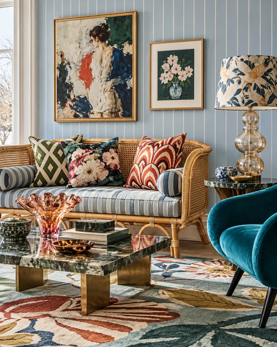
Patterns that differ greatly in form can still belong together if they share colour.
Pick one or two colours to recur across several patterns rather than matching everything exactly. A petrol blue appearing in the rug, a striped cushion and an armchair is enough for the eye to read the whole.
Be brave enough to introduce a colour that breaks the palette, too. A rust, a plum or a deep mustard in an otherwise blue-green room makes the combination look chosen rather than ordered as a set. For more on colour, explore our colour and material guides.
Repetition creates coherence. It might be a colour, a motif or a scale returning in several places around the room.
Repetition is not matching, though. Curtains, cushions and armchair in exactly the same fabric look like a ready-made collection and strip away personality. Let a motif echo instead: a fan in the wallpaper and an arc in a footstool, a stripe on a cushion and a stripe on a lampshade.
Prestaged notes: Repetition does not have to mean matching. It is often enough for the eye to recognise something a second time.
A pattern grows stronger and more sophisticated when it has room to breathe. Plain surfaces in velvet, linen, lacquer or stone rest the eye and let the patterns show.
A deep green velvet sofa, a plain wall or a timber floor does more for a pattern mix than yet another pattern. It is the contrast between stillness and movement that makes a room feel luxurious.
Prestaged notes: It does not have to match. It has to belong.
The most common mistake is to gather all the pattern into small accessories. The result is often busy, because many small patterned surfaces fragment the room.
Try pattern on:
A larger pattern statement can feel calmer than many small ones. A patterned wallpaper in a bathroom or a graphic rug beneath a plain sofa makes a clearer statement than ten different cushions.
Prestaged notes: Don't let all the bravery end up on the cushions.
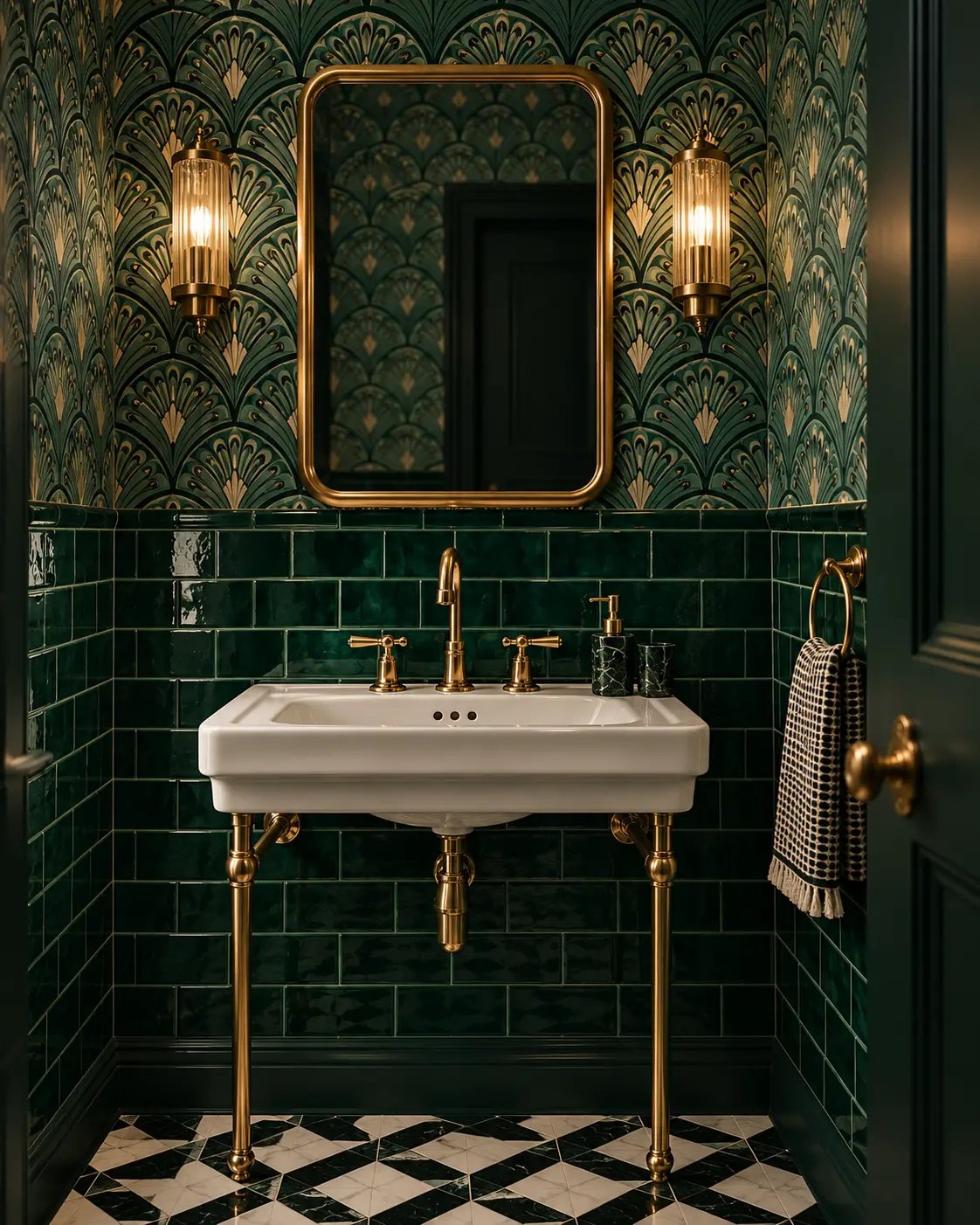
Small patterns behave differently from a distance. A tight check that looks lively up close can read as a plain surface from across the room, while large patterns stay legible far away.
Think of pattern as tempo:
A room with only dense patterns becomes frantic; a room with only large ones can feel heavy. The mix creates rhythm, much as it does in music.
The same pattern feels different depending on the material.
Remember that natural materials act as pattern too. Marble, figured wood, stone and herringbone parquet all add visual movement. Count them when judging how much pattern a room already holds.
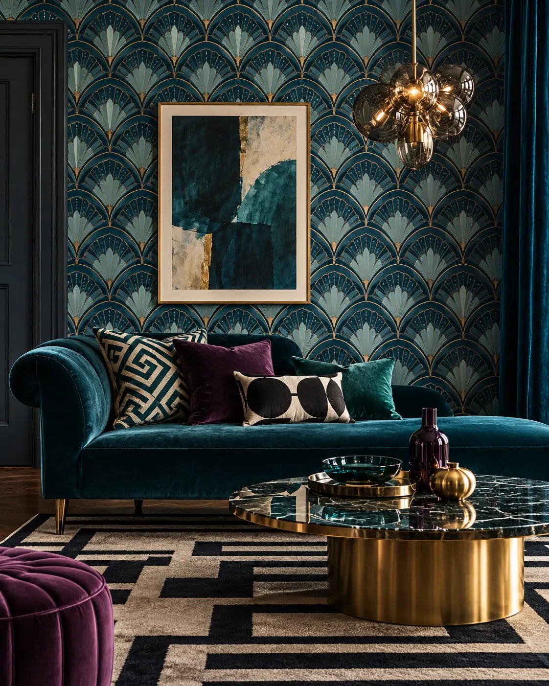
Classic interiors can hold a great deal of pattern without tipping into maximalism. The secret is structure: clear scale, a recurring palette and plenty of calm surfaces. Art Deco is a good example, where graphic fans, stripes and geometry coexist thanks to firm symmetry and carefully chosen materials.
To explore that direction further, see our style guide to eclectic interiors.
A few signs that the room has tipped over:
You rarely need to remove every pattern. Start by swapping one medium-scale pattern for a plain surface in the same colour, or by gathering several small patterned pieces into one larger one. A single change is often enough to let the room breathe again.
Pattern on pattern is not about adding as much as possible. It is about choosing, ranking and giving each pattern its place.
Inherited pieces, finds and new purchases in the same room. What holds it together is rarely the style — it is the palette.
Read the guideGood lighting is not about making a room as bright as possible but about hierarchy, direction, contrast and depth. Prestaged's guide to layered light at the right heights and the right colour temperature, with room-by-room advice and a checklist for your own home.
Read the guideInherited pieces, flea-market finds and new furniture in the same room. The palette holds the mix together — not the period.
Read the guide