Prestaged fixes
Why does the room feel wrong? 7 common reasons
The furniture works beautifully on its own, yet the room still feels unfinished. Seven recurring reasons — and what to do about them.
Read the guideArt changes a room more than almost any other detail – but its placement determines whether a work feels inevitable or slightly wrong. It is less about fixed rules than the relationship between art, furniture and empty space. Prestaged's guide moves from one large work to a personal gallery wall.
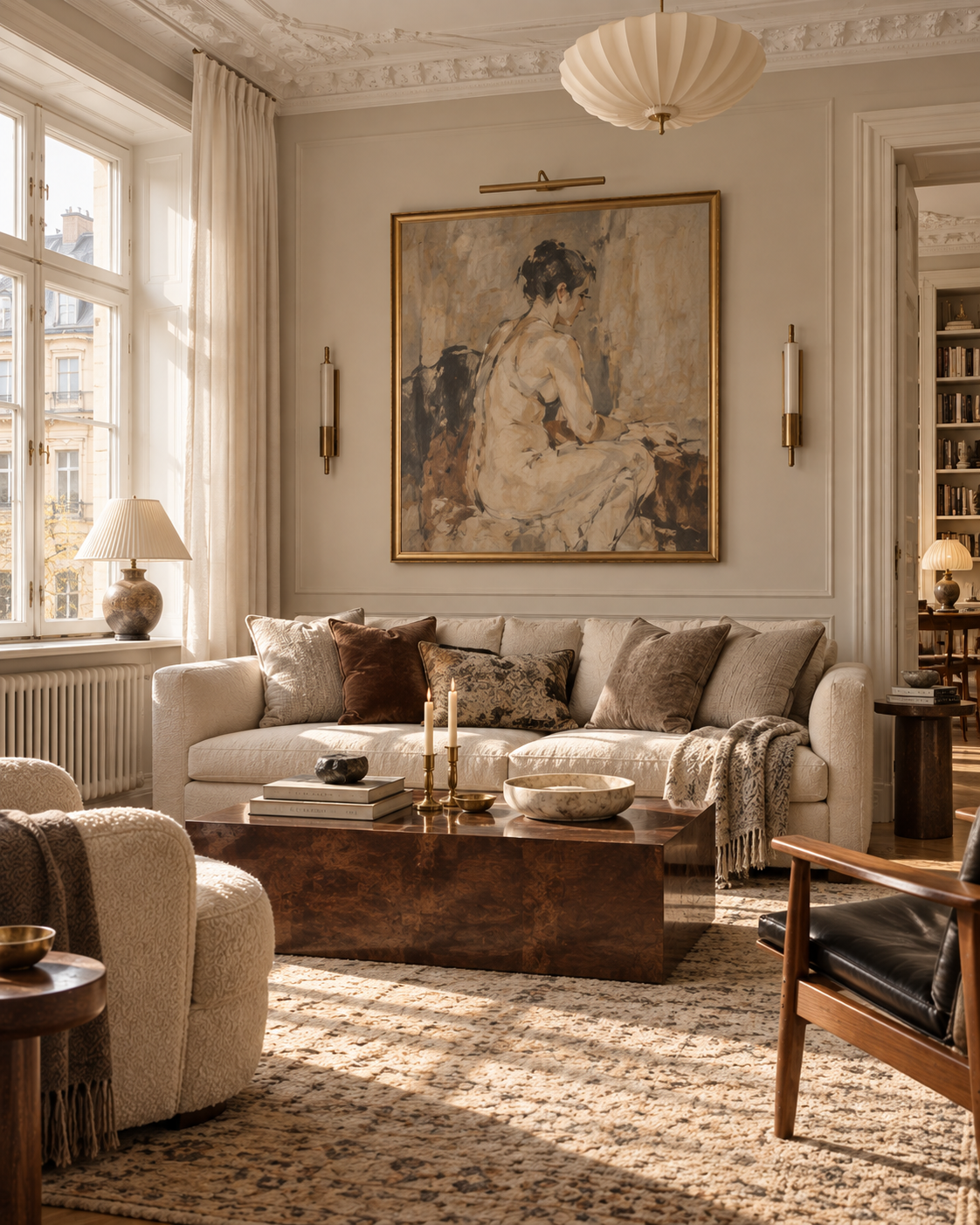
Art changes a room more than almost any other detail. Yet it is the placement – the relationship with furniture, architecture and empty space – that determines whether a work feels inevitable or slightly wrong.
There are useful measurements and visual reference points. They work best as a beginning, not a verdict. A work can hang lower than expected, a group can be asymmetric and a small painting can carry real weight in exactly the right place.
An empty wall does not automatically need filling. First consider what the art should relate to: a sofa, dining table, bed, console or perhaps an entire sightline through the room.
The most common mistake is to centre a picture on the wall when it should really be centred on the furniture or group below. Think of the art and furniture as one composition. It then becomes easier to see whether the work belongs in the middle of the sofa, aligned with one edge of a chest or deliberately drawing the eye to one side.
Prestaged notes: Art does not need to fill empty space. Sometimes the empty space is what makes the work feel important.
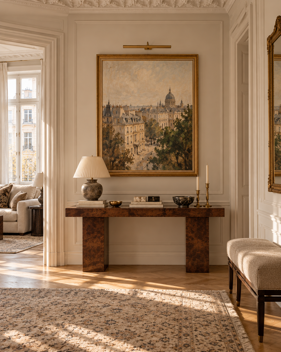
As a starting point, the centre of a work often sits at roughly eye level, usually around 145–150 centimetres from the floor. Treat that as a point of departure, not an absolute rule.
In a room where people mostly sit, the art may need to come down. In a hallway where it is seen from a distance, the architecture and sightline may matter more. Test the height from the position in which the work will actually be experienced – not only while standing beside the wall.
Above a sofa, bed or chest, the relationship with the furniture matters more than the measurement from the floor. A useful visual reference is often around 15–25 centimetres between the top of the furniture and the bottom of the art.
Hang it too high and a gap appears; the work begins to feel disconnected from the rest of the room. What matters is that the two read as a composition.
A small picture hanging alone above a large sofa is one of the most common mistakes. Above a wide piece of furniture, art can afford to take up real space. A larger work or a coherent group may often span roughly half to two-thirds of the furniture's width.
This is a visual rule of thumb, not mathematics. Check the scale from across the room. From there, it is easier to see whether the art holds the wall or merely happens to hang on it.
If you love a small work, do not ask it to perform the role of a large one. Give it a smaller context: above a side table, beside a doorway, between two windows or as part of a group.
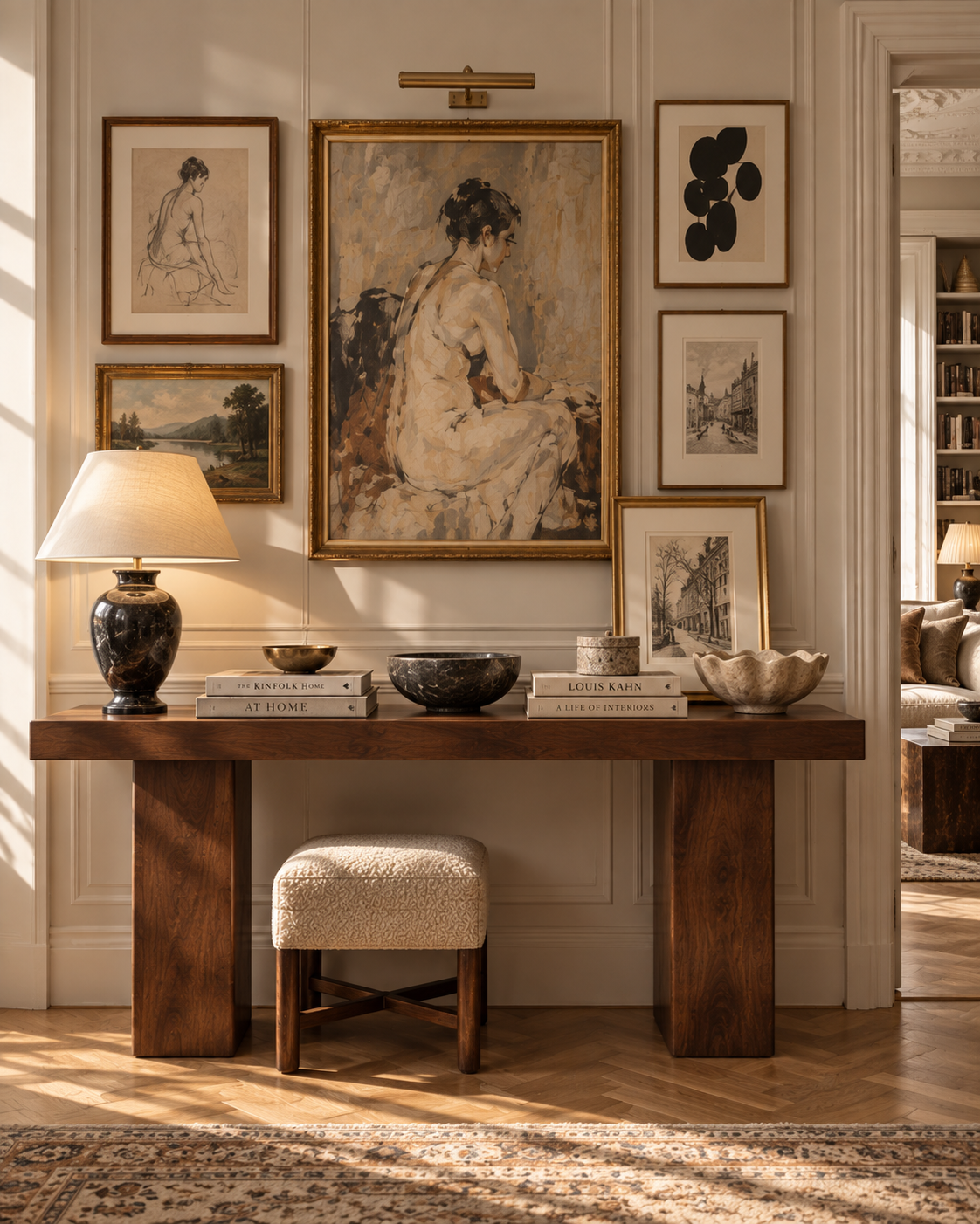
A larger work brings calm, clarity and often a more architectural expression. It works particularly well above a sofa or bed, in a generous hallway or on a wall seen from a distance.
Give it enough space around it. A work with real presence rarely needs company simply because the wall is wide.
A group brings more personality and makes room for photography, paintings, prints and smaller finds. But a gallery wall becomes stronger when something holds it together.
That might be recurring colours, related frames, relatively consistent spacing, a shared subject – or simply the sense that every work was personally chosen. Not everything needs to match.
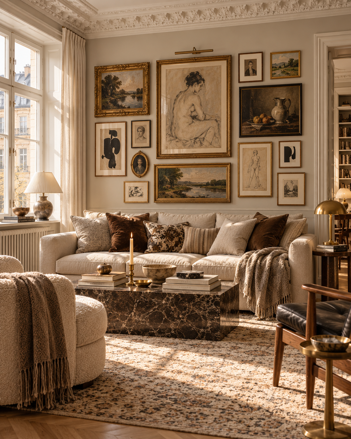
Begin with the most important or largest work and build outwards. Let it become the anchor for the rest of the composition. Keep the spaces between works relatively consistent, while allowing sizes, orientations and frames to vary.
Lay the whole composition out on the floor first and take a photograph. Imbalances are often easier to spot in an image than while standing directly in front of the arrangement.
A straight top or bottom line, regular spacing and related formats create a calm, graphic expression.
Different sizes and positions are balanced around a larger anchor. It feels freer and more evolved, while remaining clearly coherent. Prestaged usually favours the latter: order that does not reveal all its work.
Art can lean on a chest, rest on a picture ledge, stand on the floor, sit in front of books on a shelf or be combined with mirrors, ceramics and sculpture.
A large work leaning against the wall can sometimes feel more relaxed and interesting than the same piece perfectly centred on two screws. It also helps a home feel as though it has evolved rather than been completed in one styling session.
A small work between cupboards or above a worktop can make the kitchen feel less purely functional and more like a room.
Art can make a considerable difference here, but choose materials and placement with humidity in mind. Originals on paper and delicate frames do not belong close to a shower or bath.
One strong work can set the tone for the rest of the home. Look at it both close up and through the doorway from the next room.
Hang art beside – or sometimes in front of – shelving to give the composition greater cohesion.
Not everything needs to sit on the room's main axis. An unexpected position can make the eye linger.
Black frames around everything are simple, but not always the most interesting answer. Try combining dark wood, oak, fine metal, painted frames and older ornamented frames.
If the art itself shares a sensibility, variation can make the whole feel richer. An older painting in a worn timber frame beside a contemporary photograph in fine metal can be far more compelling than a completely identical gallery.
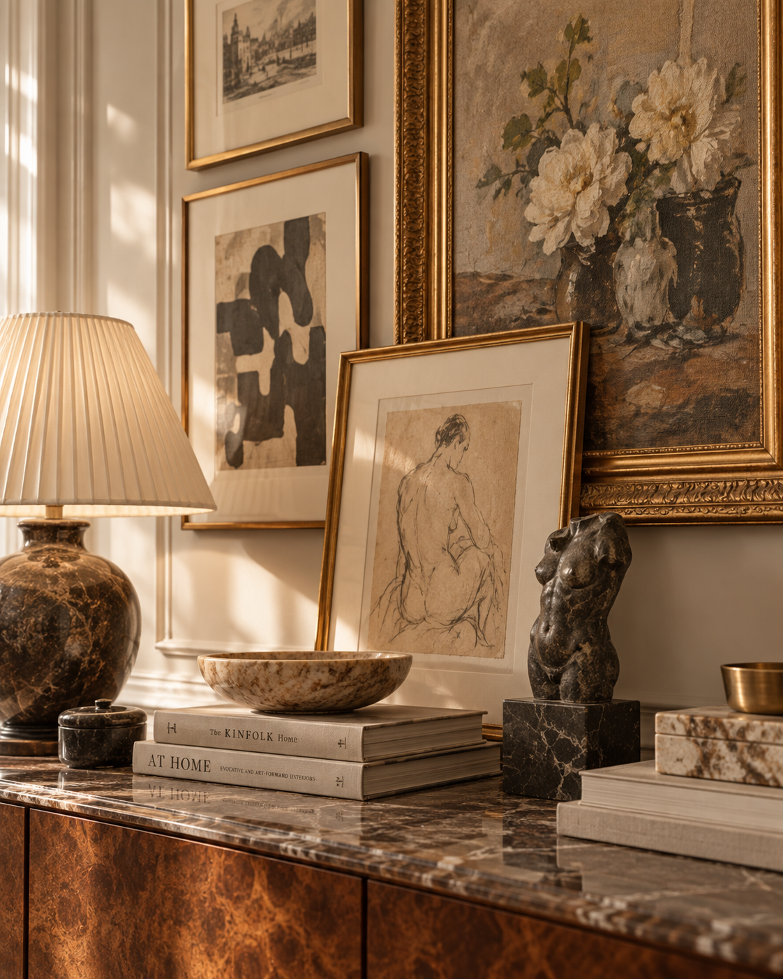
The important thing is not that the art hangs ‘correctly’. It is that it appears to belong there.
The furniture works beautifully on its own, yet the room still feels unfinished. Seven recurring reasons — and what to do about them.
Read the guideInherited pieces, flea-market finds and new furniture in the same room. The palette holds the mix together — not the period.
Read the guideInherited pieces, finds and new purchases in the same room. What holds it together is rarely the style — it is the palette.
Read the guide