Style guide
Scandinavian interiors – light comes first
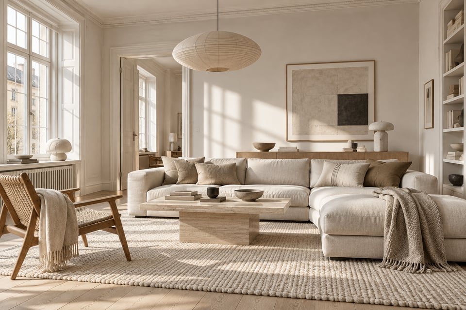
Light, wood and function before decoration. What actually makes a room feel Scandinavian.
Worktops, working space and three layers of light. Kitchen decisions can stay with you for decades — here's how to get the foundations right.
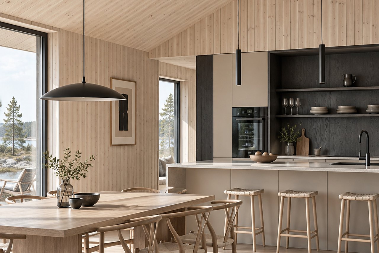
The kitchen is where aesthetics and practicality meet most directly. Surfaces are worn every day, the light has to be both functional and soft, and the decisions stay with you for twenty years. That makes material choices matter more here than anywhere else in the home.
Before doors and colour: measure the worktop between sink and hob. Below 60 cm, cooking becomes cramped however beautiful the kitchen looks. Where space is tight, it is almost always better to sacrifice a row of wall cabinets than an uninterrupted stretch of worktop.
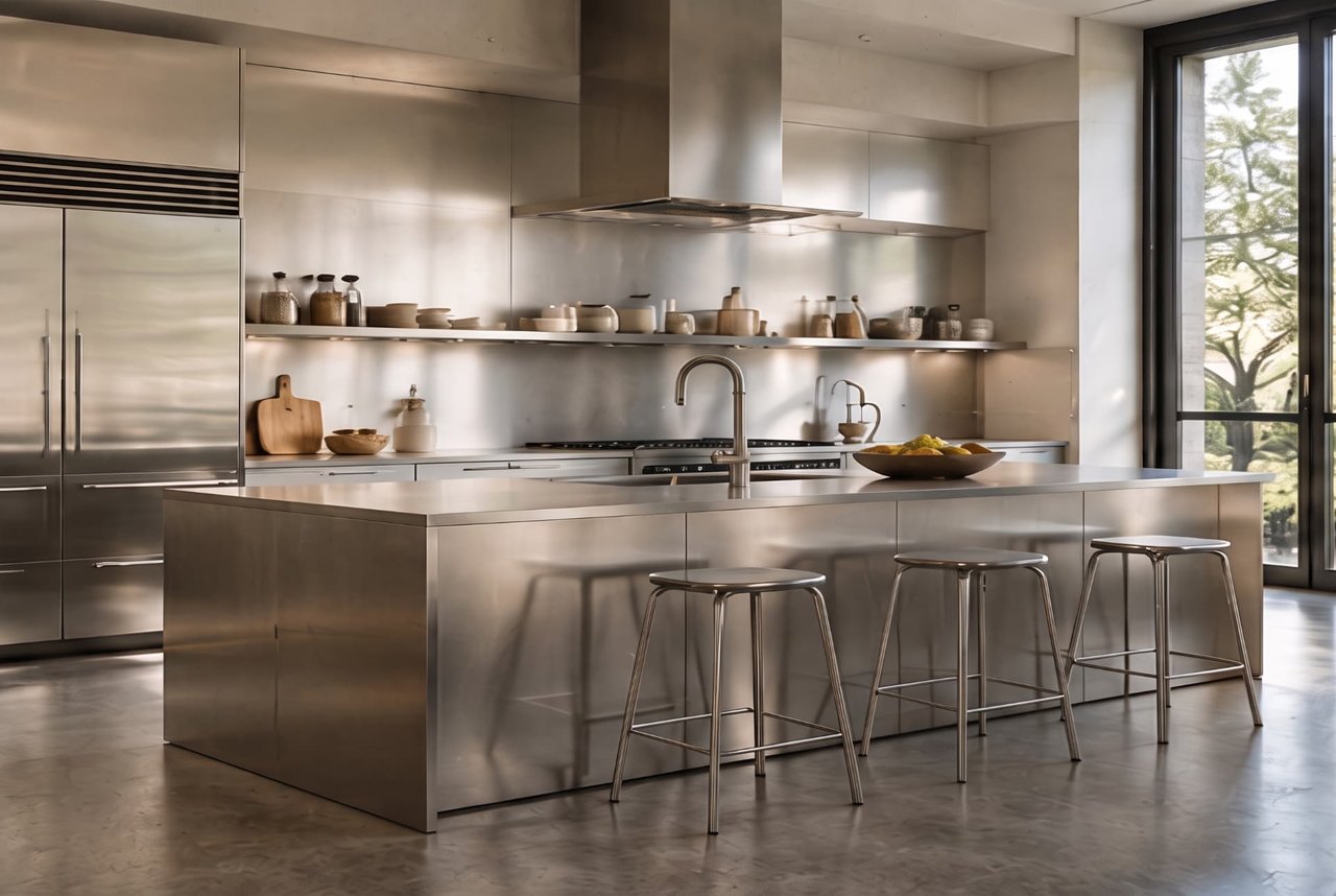
The worktop is what you touch, look at and wear out. Solid timber grows more beautiful with age but needs oiling and will not tolerate standing water. Natural stone such as limestone and travertine is soft, matt and ages visibly — if you want a surface without patina, it is the wrong choice. Stainless steel is one of the most honest materials in a kitchen: it stands up to almost anything, develops a matt sheen over time and avoids the commercial-kitchen look as long as it is used on one surface rather than everywhere.
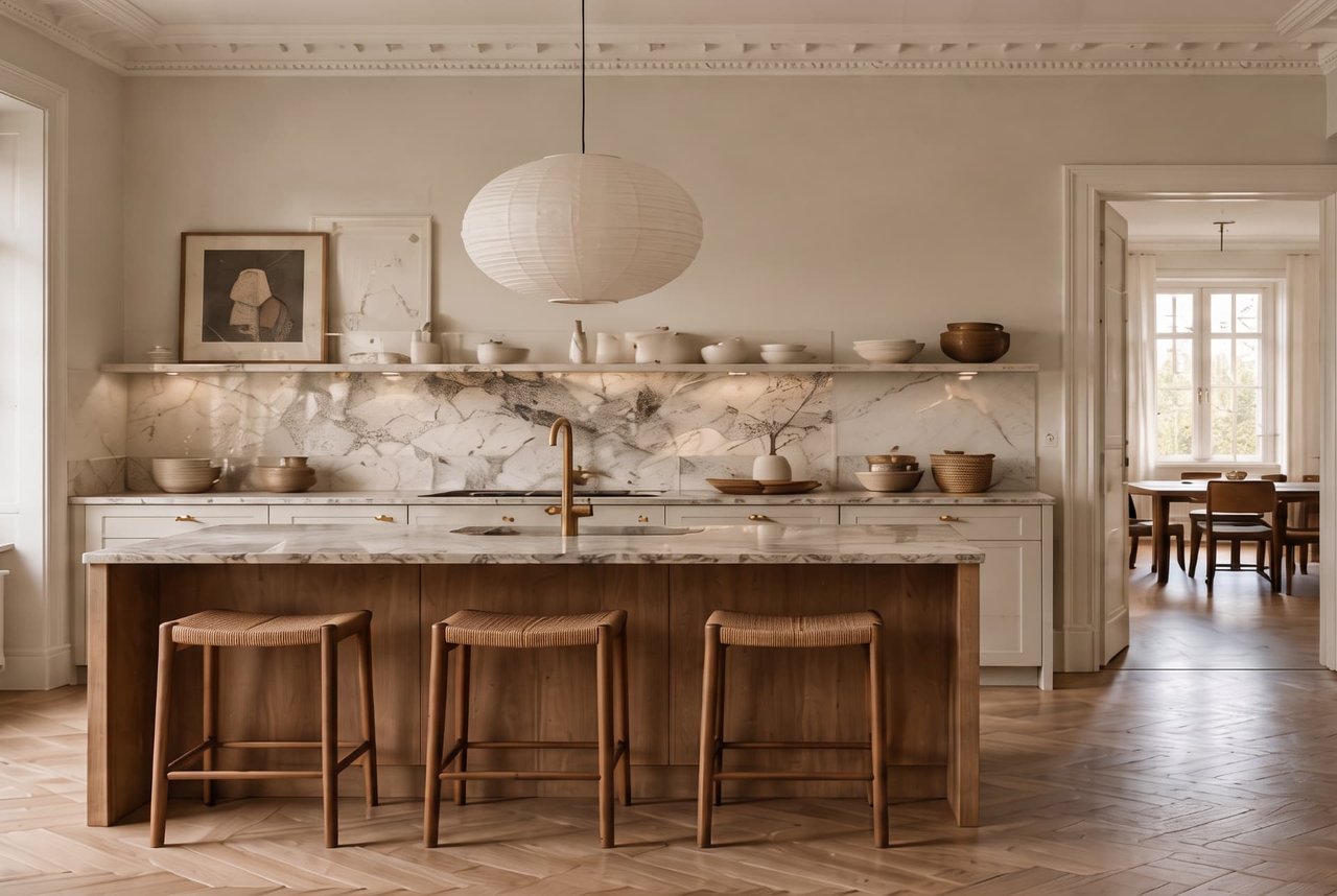
Light kitchens feel larger, dark kitchens feel calmer. Muted shades — greige, grey-brown, deep green — hide everyday wear better than white and tend to feel more at home in a lived-in Nordic kitchen. If the room has little daylight, keep the wall cabinets lighter than the base units.
A kitchen needs task light under the wall cabinets, a softer ambient layer and something warm above the dining table. Set the counter lighting at the front edge of the cabinet so the shadow falls behind your hands rather than across the chopping board.
Small choices are seen daily. Brass warms with time, stainless steel and chrome stay neutral, black metal gives clear contrast against pale timber. Choose one metal and stay with it — mixed metals in a kitchen take a great deal of discipline to work.
Light, wood and function before decoration. What actually makes a room feel Scandinavian.
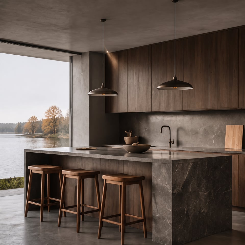
Muted colours, dark wood and pronounced materials. The Nordic tradition with depth instead of brightness.
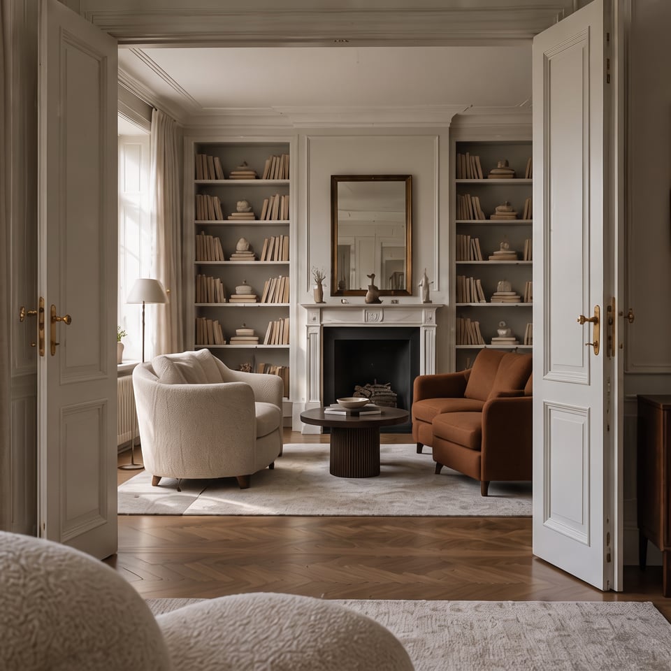
Stucco, panelled doors and herringbone parquet already do the work. The rest is about not competing with them.
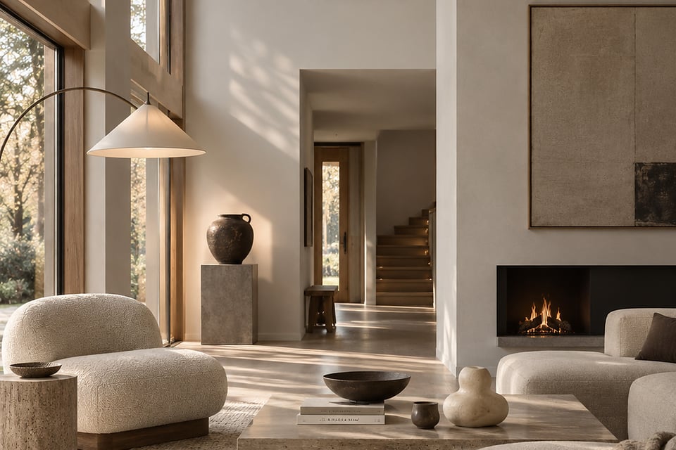
Minimalism is rarely about owning little. It is about choosing what is allowed to remain visible.
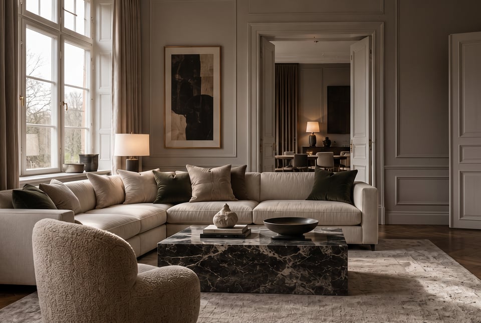
One of Sweden's most common interior colours is also one of the hardest to get right. Three levels of lightness are enough to create depth.
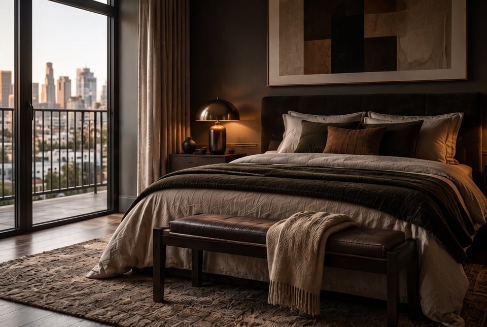
Brown brings warmth where black brings severity. How to use it across large surfaces without weighing down the room.
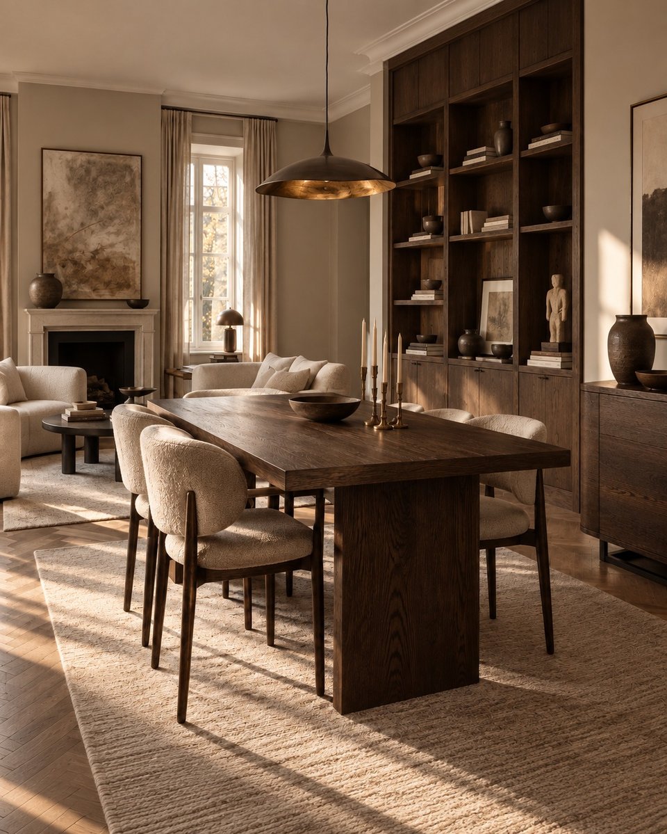
Visible grain, a hard-wearing surface and enough weight to anchor a room without making it dark. How to combine dark oak.
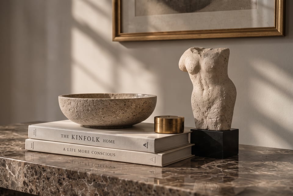
Travertine, limestone and marble belong to the same family but behave very differently. How to choose the right one.
Durable, honest and finished with a soft matt sheen that ages well. How to avoid the professional-kitchen look.
Read the guideVisible grain, a hard-wearing surface and enough weight to anchor a room without making it dark. How to combine dark oak.
Read the guideMuted colours, dark wood and pronounced materials. The Nordic tradition with depth instead of brightness.
Read the guide